Google's re-branded header makes me go (slightly) crazy
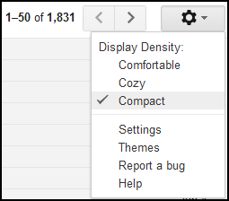
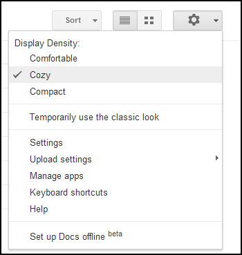
Since I'm such a devout Google user, I often have GMail, Google Calendar, and Google Drive (formerly Google Docs) open in three different tabs on Google web browser - Google Chrome. I'm often switching between tabs. Here's what it looks like when I switch from each one on Google's re-branded user interface:
These sorts of tiny details make me go crazy! The logos are different sizes, the buttons are different sizes, and the width of the sections are different sizes. There's also different spacing and indentations.
It makes me wonder what happened. Google tirelessly optimizes its user interface based off A/B testing of millions of users. Is it perhaps that I am in the "A" test group for GMail, and in the "B" test group for Drive? Some people think this is fantastic. Although we're getting there, this is still not what I would call a unified user interface.
Update 6/5/2012: Looks like it's just a matter of changing the settings from cozy, compact, to comfortable, which doesn't carry over from service to service.


